Thursday, August 11, 2005
Photography school
My digital photography leaves much to be desired, but I did come up with an excellent, low-cost idea for learning about photography. I got my talented photographer friends together for a "photo walk" on which we all snapped away with our digital cameras and then compared our results. Since we snapped many of the same subjects, I could really start to learn something about composition by the comparisons. Look at these pics of Mickey's Tavern:
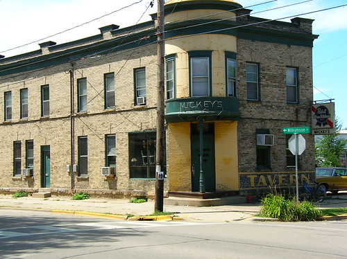 by Oscar
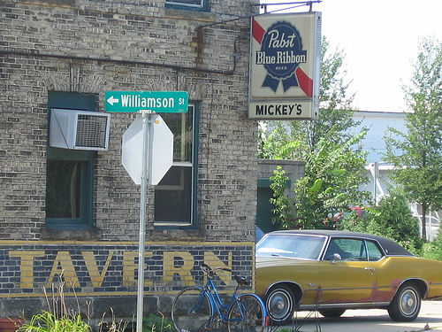 by Blogger Friend #1
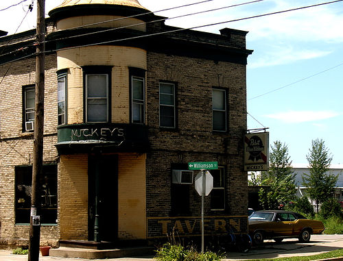 by Blogger Friend #2
Notice how all three of us were standing in about the same spot. My photo is very blah -- I'm just recording the fact that Mickey's Tavern is there. Both Friends 1 and 2 saw that the car parked around back had to be an important element of the composition. And the street sign -- to me, it was just in the way. Friends 1 and 2 seemed to understand some "if you can't beat 'em, join 'em" principle: that if an obstruction is an immovable part of the scene, it's better to feature it than pretend it's not there. #2 followed the same principle with the power pole and wires, while #1 framed those out of the photo. I tried (unsuccessfully) to ignore them.
There are maybe five elements that make this photo worth taking: the brickwork of the building; the Queen Anne style turret/doorway; the painted "tavern" sign; the beer sign; and the car. #2 captures all five, #1 captures four (trading away the turret to get rid of the power pole), whereas I really only get the brickwork and the turret, failing really to pick up the other three elements. They're there, but my composition doesn't draw attention to them.
Enough amateur photo criticism. The great fun here is the way that carrying around your digital camera makes you start to look at ordinary things around you in a more intense way. Two days after my photo "seminar,"I tried another photo walk. Here are some results:
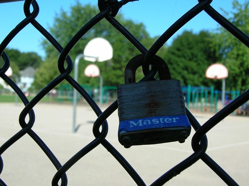
Playground security.
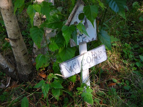
Welcome to the bird cemetary.
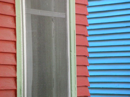
Pastel clapboard.
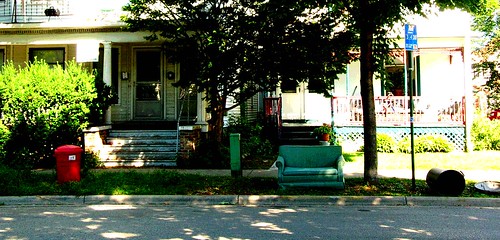
Bus stop.
by Oscar by Blogger Friend #1 by Blogger Friend #2Notice how all three of us were standing in about the same spot. My photo is very blah -- I'm just recording the fact that Mickey's Tavern is there. Both Friends 1 and 2 saw that the car parked around back had to be an important element of the composition. And the street sign -- to me, it was just in the way. Friends 1 and 2 seemed to understand some "if you can't beat 'em, join 'em" principle: that if an obstruction is an immovable part of the scene, it's better to feature it than pretend it's not there. #2 followed the same principle with the power pole and wires, while #1 framed those out of the photo. I tried (unsuccessfully) to ignore them.
There are maybe five elements that make this photo worth taking: the brickwork of the building; the Queen Anne style turret/doorway; the painted "tavern" sign; the beer sign; and the car. #2 captures all five, #1 captures four (trading away the turret to get rid of the power pole), whereas I really only get the brickwork and the turret, failing really to pick up the other three elements. They're there, but my composition doesn't draw attention to them.
Enough amateur photo criticism. The great fun here is the way that carrying around your digital camera makes you start to look at ordinary things around you in a more intense way. Two days after my photo "seminar,"I tried another photo walk. Here are some results:
Playground security.
Welcome to the bird cemetary.
Pastel clapboard.
Bus stop.
Comments:
<< Home

Oscar is unduly modest. While the second two photos focused on content, his photo is the best example of pure geometry of composition. Note the off-centered positioning of the turret and the loooong sidewalk to the left. This is an excellent example of good composition. Centering things perfectly or keeping things very symmetrical makes a picture static and takes away all the tension that draws one into a picture. As to better and worse forms of asymmetry, take a look at the Fibonacci series (reflected in pine cones) to see the golden ratios.
So Oscar, while you may have a problem with overly emotional resentment of interfering street sign and a blind eye to the iconic value of automobiles, you do have an excellent instinct for the hidden mathematics within the aesthetics of art.
So Oscar, while you may have a problem with overly emotional resentment of interfering street sign and a blind eye to the iconic value of automobiles, you do have an excellent instinct for the hidden mathematics within the aesthetics of art.
# posted by  : 2:46 PM, August 11, 2005
: 2:46 PM, August 11, 2005
I'd agree with Warren, your picture has its own goal if you will. I like the way it shows more of the building, lets you see the two rows of windows, the window AC unit. Friend #1 is almost looking at the back door, which you cannot see from your vantage point, and misses the front door completely. Friend #2 zooms in a little, but must have snapped when a passing cloud came by and got a much darker picture.
(surfed in from Althouse's house)
(surfed in from Althouse's house)
# posted by : 3:21 PM, August 11, 2005
: 3:21 PM, August 11, 2005
I really like your playground security picture. I really enjoy that "look[ing] at ordinary things around you in a more intense way" because you're carrying a digital camera. That never quite happened for me with my 35mm camera--I guess on some level I didn't want to "waste" film by snapping random photos. But the digital allows you to just snap it and therefore encourages a more radical kind of visioning of the world around you.
Post a Comment
Subscribe to Post Comments [Atom]
<< Home
![]()
Subscribe to Posts [Atom]